
Fix your signup form error messages: 5 reusable patterns for your SaaS product
- Dec 15, 2025
- 6 min read
Updated: Jan 15

Vague error messages in your forms are killing SaaS trial signups. In one moment, users enter an email, password, company name, and click submit. Next, they're greeted with an "invalid input" message and no fix nearby. They leave not out of frustration, but because the form gives them nothing to work with.
Error messages aren’t fine print; they’re feedback loops.
Clarity is activation. Every error message either accelerates a user toward “first value” or slows them down when motivation is most fragile. Signup form error messages are more than a microcopy task; they’re product decisions that influence your brand's conversion, retention, and trust.
A single trial signup flow already contains the five error cases you need to design a scalable pattern library for your SaaS product. Fix them once, document the rules, and you raise the clarity of every form your users will ever touch.
Turn Friction into Flow: 5 Core Error Cases for Trial Signup
Look closely at a signup form, and you’ll realize the failures form a pattern. The same interactions break down in the same ways, creating predictable pressure points where users decide whether to continue or quit.
Email Errors: Is the email incorrect, or does it already exist in the system? The user tries to proceed, but the form gives them nothing. Without clear guidance, they keep guessing or worse — abandon.
Password Errors: Password fields are friction factories when the security rules stay hidden. Users enter something reasonable, hit submit, and only then learn what the system expected.
Required Field Errors: Few things break momentum faster than hitting “Continue” and watching the form explode in red. A user shouldn’t learn the requirements only after the form rejects them.
Billing Detail Errors: Payment fields are high-stakes interactions. Users are entering sensitive payment information and need precise feedback. Vague messages like “Invalid card” create uncertainty and undermine trust.
Generic or System Errors: When something breaks behind the scenes, users need more than clarity; they need reassurance and direction. A generic error with no next step leaves users stranded.
These five cases account for the majority of signup friction. Fix these, and you'll break the patterns once and for all.
Audit Your SaaS Trial Signup Form
You can’t design great error messages until you see where your current ones are lacking. A trial signup form is a stress test for the entire product. Push it, and it reveals how your system behaves when something goes wrong.
Most forms fail in predictable ways. Errors appear far from the field they relate to. Red borders appear without explanation. Messages describe the failure but never tell you what to do next. These tiny gaps create silent churn. A user shouldn’t have to decode the form’s intent — clarity should be instant.
Your audit is where the raw truth emerges:
Start by walking through the form the way a new user would. Submit incomplete data, incorrect formats, and mismatched values.
Capture screenshots, copy existing messages, and mark every moment where the experience hesitates.
Now start to evaluate what you see against your UX criteria.
Form Error Message UX Criteria
Use the checklist below to assess whether your form follows signup form error messages best practices and supports quick, confident recovery:
Is the error field clearly highlighted?
Is the message in close proximity to the error?
Does it explain exactly what is wrong?
Does it offer an actionable solution or next step?
Is the language simple and easy to scan?
Does it avoid blaming the user?
Is it concise enough to understand at a glance?
Document everything. Now you have your “before” examples and the starting point for defining consistent, reusable error patterns. These observations form the foundation for the patterns you'll design, moving from ad hoc fixes to systematic clarity.
Fix Your Signup Form: Before/After Microcopy for Error Messages
Error messages are small moments with outsized impact. When they’re vague, they drain momentum. When they’re precise, they demonstrate competence and care. Don’t think of them as “error messages”; think of them as “error fixing messages” – they become more concise, actionable, and accessible to your users.
These before-and-after form error message examples show how small changes in placement, language, and structure dramatically improve recovery.
Email Error Microcopy

Instead of a quiet failure, the error now speaks up. The field is clearly flagged, the message sits where the problem occurs, and the fix is spelled out with the expected format. There’s no guessing, just a clear path forward that keeps the user moving.
Password Error Microcopy

The field is flagged, the rule is clear, and the blame is gone. A short message tells users exactly what to do, while the progress bar shows how close they are, turning a rejection into motivation.
Required Field Error Microcopy

The field requirement is now explicit, removing ambiguity caused by the asterisk alone. The next step is obvious, and the polite tone helps reduce friction and frustration at a key moment.
Billing Detail Error Microcopy

The form now shows its work. The field is flagged, the rule is explicit, and the spacing makes the card number easier to enter correctly. Blame and ambiguity are replaced with clear, polite guidance that helps maintain trust at a high-stakes moment.
Tip: Use input validation to automatically standardize the format of fields requesting card numbers, sort codes, dates, times, etc.
Generic/System Errors Microcopy
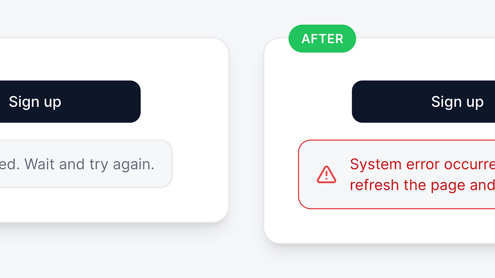
The icon and layout clearly signal a system issue — not user error — and the message tells them exactly what to do next. The result is clarity without blame, even when the issue is on your side.
Scale Your UX Content: Build Reusable Content Patterns
Clear before/after examples are useful, but they’re not yet reusable. To scale clarity across a product, you need to turn these examples into content patterns: structured, repeatable models that capture how your product should speak in specific situations.
A content pattern isn’t “the line we like,” it’s the blueprint behind that line: the logic, the variables, the tone, and the rules that make it work every time.
A polished error message is a tactic. A reusable content pattern is a strategy.
A good content pattern contains the following:
Pattern Name: A clear label the whole organization can reference
Scenario Description and When to Use It: The exact moment the pattern applies
Structure: The clear order and format to follow
Core Pattern Text: The approved phrasing for that scenario
Variables: The elements that can change depending on context
Examples: Sample output adaptations across different situations
Do/Don’t Rules: Guardrails that prevent message drift
Tone Guidance: How the message should sound, especially in high-pressure moments
Document Patterns into Your SaaS Content Design System
Patterns only become powerful when they live somewhere visible. A message sitting in a file is a moment. A documented pattern inside your SaaS design system is an asset.
Once your patterns are defined, add them directly into your design system so teams can reuse them without rewriting. A clear entry connects each pattern to the component it supports. It should include:
Label: E.g., Form field → Email → Error state
UI Component: The visual context the copy appears in
Content Pattern Details: The structured pattern defined earlier
Related Patterns: Links to relevant patterns like success messages or inline hints
Turn clarity from “something we did once” into “how our product speaks.”
Tip: Think of your design system as the home for your product’s decision-making; teams work from the same source of truth, and the product speaks with one voice.
From One Form to a Full System
With a more strategic approach to your SaaS form content, your fixes aren’t just a cosmetic upgrade; they become a blueprint for a better user experience that extends far beyond signup. Improve it once, and you raise the clarity of your entire product.
A system like this pays off everywhere, but it takes time, expert craft, and cross-functional alignment to get it right. Most teams don’t need more templates; they need a content design partner who can turn clarity into a repeatable operating model.
If you want your product to speak with intention at every touchpoint, book a call and we’ll build the content system that gets you there.
Conclusion: Embrace Clarity for Growth
In the fast-paced world of SaaS, clarity is your best friend. It transforms user experiences and drives conversions. By addressing the common pitfalls in error messaging, you not only enhance the signup process but also build trust with your users.
Remember, every interaction counts. Your users deserve clear guidance, especially when they hit a snag. So, let’s turn those vague error messages into powerful tools for engagement. After all, clarity is the key to unlocking potential and driving growth.
Let’s make sure your forms are not just functional but also a delight to use. Embrace clarity, and watch your conversion rates soar!


Comments